DISCLAIMER: I did not work on this game.
This is an analysis from the perspective of UI/UX.
Wordscapes
(Developed by PeopleFun)
Wordscapes is a mobile word puzzle game where you make words from sets of given letters.
Icon from PeopleFun.com
My analysis of Wordscapes is based on what the average user would see in their first 15 minutes of playing. Overall, the UI presents relevant information, directs the user’s attention, and is aesthetically pleasing. However, there are two buttons that I don’t believe properly convey their functions, and I ran into two situations where I wasn’t able to preform a task that I expected to be available. While not crucial functions, their absence was unexpected.
Wordscapes clearly sticks to a design philosophy of simplicity, evoking the wide-open natural spaces in its backgrounds. As a game made for players to challenge their brains, these simple aesthetics don’t overshadow that goal.
Successes
Minimal visual clutter
Makes the most of screen space and creates a calm atmosphere
Foreground contains few colors and simple shapes
New buttons appear with progress, but it maintains minimalism
Majority of important information stands out with a partially translucent background
Notable exception: level titles sometimes blend with the background (see Issues)
Instant visual feedback on input
Buttons get an outline on tap, and bounce on release
Movement occurs on all state changes
e.x. Objects fall away or shrink when changing screens; collected coins fly from one corner of the screen to another
Issues
Level titles sometimes blend with the background, depending on the background image used
Proposal: Use the same translucent background as the rest of the UI, outline the text, or use non-conflicting backgrounds
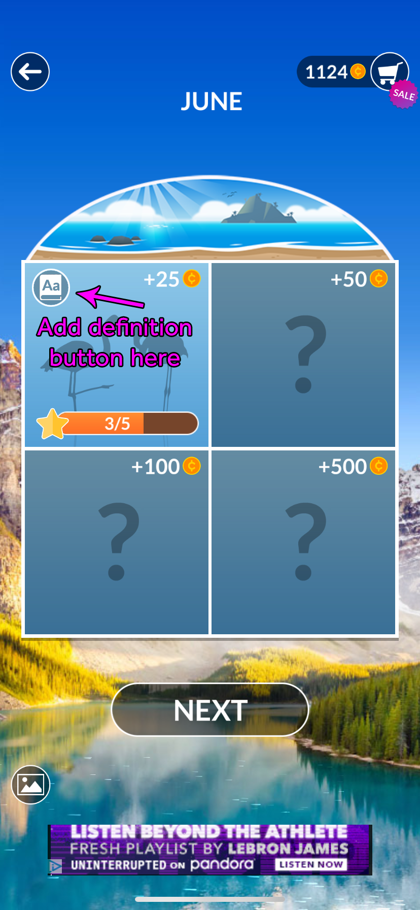
After completing a Daily Puzzle, there is no button to see definitions as with normal puzzles
Proposal: Add a definition button on the Daily Puzzle page upon completion (see images for example)
Below the Daily Puzzle, the Next button has no indication that it leads to the current “campaign” puzzle
Proposal: Replace the image with the button used on the main menu for the same purpose
Can’t access settings during a puzzle, and have to return to the main menu first
Proposal: Add the Settings button to the top left
The Level Select button doesn’t visually convey its function (it uses ellipses that often signify “more” or “options”)
Proposal: Replace the ellipses with a puzzle piece icon (see images for example)
[Click an image to expand it]