DISCLAIMER: I did not work on this game.
This is an analysis from the perspective of UI/UX.
Dungeon Boss
(Developed by Boss Fight Entertainment)
Dungeon Boss is a turn-based strategy RPG with collectible and upgradeable Heroes.
Game icon from app store
Redesign images made with Adobe XD
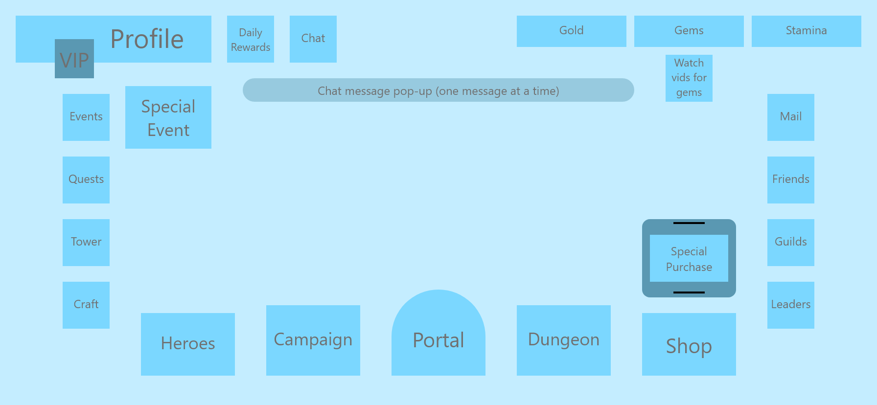
Base Homepage
My Redesign (gif)
My approach to the Dungeon Boss homepage focused on button placement and readability. My redesign shows how this exact menu could be laid out to group actions according to their uses. As such, I chose not to combine any buttons (e.g. ‘Friends’, ‘Guilds’, and ‘Leaders’ could all be under a ‘Social’ menu in a different design).
The redesign takes into account a modified version of the Gutenberg Principle, which dictates how a person takes in information on a screen/page. As an interactive screen, players will learn the layout and then scan distinct sections in search of their desired option. As such, each section’s contents are arranged to emphasize certain options. For the Primary Actions section, button size and shape also affect emphasis.
Redesign Sections
Changes
Primary actions are rearranged
‘Portal’ stays central
The two primary uses for heroes flank ‘Portal’
‘Shop’ is with less common actions on the right
‘Heroes’ is near secondary actions on the left
Secondary actions and player goals (e.g. quests) are now grouped on the left
‘Events’ and ‘Special Event’ are now together
‘Tower’ is placed with other daily actions
Special purchases are now aligned with ‘Shop’
It’s clear that the special purchases scroll (see redesign gif above)
Infrequent actions are at the top right, near other actions
Small buttons on the sides are given more space for less visual clutter